Interior Design Course


Have you ever stopped to think about why we choose the different professions that we do? Many times you see children follow in the footsteps of their parents when it comes to professions especially law enforcement, attorneys and medical professions. I guess a part of this is exposure to the field and knowledge of different aspects of the jobs from watching our parents. I went into the social services field because I was impressed with the job the hospital social worker did in helping us make plans for my dad when he had a heart attack. Prior to that experience I did not know anything about social work.


I worked in the field of social work for over twenty years. It is a low paying profession, however there is the satisfaction of knowing that you have helped better someone’s life through the services you help them access. I am glad that I chose the career, but I knew I needed to have a break from it. Dealing with people’s problems and issues day after day year after year has a way of taking a toll on you. I have always enjoyed decorating. This was my way of escaping the pain and emotions that I faced during the week. I have painted every room in my home various colors through the years. I love to rearrange furniture and change the art work on the walls. My husband suggested that I take some interior design courses. He feels that I have skills in this are and it would be a nice change of pace for me. I had never considered taking interior design courses until he mentioned it. Once I started thinking about it I thought it would be fun to work with people on arranging their homes rather than arranging for their mental health needs. I was already very comfortable in interviewing people and working with them in their homes, we would just have a different focus.


I found the closest community college that offered interior design courses and went to talk to the instructors. I told them that I knew that I would be the oldest one in the class but I thought I would be able to handle this. They assured me that this was not true. They have people switching careers all the time and that the student population was made up of a wide range of ages. As I began to take the interior design courses I realized that this was very true. The majority of the students were traditional college age, but there were enough of us old students around that I did not feel like I stood out. I am so glad that I was open minded enough to consider doing something else. It is exciting to have a whole new career opening up for me.

Having Fun With Pivot Stickfigure

Do you know, you dont have to study hard to make your own animation. Cause today i have a little program but more powerful to having fun. Its called Pivot Stickfigure Animation. This is my sample animation :D
It's seen fun right :D, if you not patient to start, you can download the program at this

Follow this tutorial create your first animation :D :

1. Open the program (its portable program), you will see a stickman are waiting to have fun with you :D.

2. Try to move the red point to make a move action

3. Clik Next Frame button to make a first frame. You will see at top a frame was update.

4. Repeat point 2 and 3 with another point what do you like to make its dance :D

5. If you are finished your frame, click Play button to see your stick move :D

6. You will smile while see it at first right :D hehe its fun.. you can save your animation at File > Save Animation > Click at Save as Type and choose your type > OK.

7. This is some animation from me :D Enjoy to see it...


If you want to add some effect as the animation above, visit this link Enjoy it :D..

Top 100 Best Font To Support Your Design


Talking about the design would not be separated from the font. There are many well-known companies use the font as a symbol / logo of the company namely Samsung, Microsoft, Dell, Intel, Nokia, etc..


Not hard to design a logo, but the hardest thing was figuring out a suitable font for a logo. Simple, clear, elegant, and easy for remember it. For a designer, the image is rice and the font is salt (hehe..). Many sites you may know about free download font like 1001freefontdafont.com, and fontyukle.net.

But dont worry it. i will give you Top 100 Best Font To Support Your Design. Just click this link.

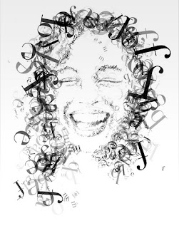
This is sample design called Typography using photoshop and tutorial is coming soon :D...


Stay follow up this blog for more informative articel... :D

Tutorial Design Your Stamp Using Freehand

Articel previously is about how to design your wallpaper using photoshop. Today i will tell you about make a stamp, ups not make just design a stamp using vector program Macromedia Freehand 11. If you don't have, you need to click this link before you read this tutorial.


Lets having fun with it :
1. Open your freehand program
2. Ctrl + N at keyboard to make a new file
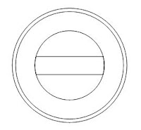
3. Press O at keyboard to make a circle like this (hold shift if u want to make a good circle)
4. Press V to change your kursor to pointer, then press Ctrl+Shift+D to duplicate object.
5. With hold Alt+Shift drag  the little blue sign at right up corner and drop into first cirle like this

6. Repeat step above to make another one until you have 3 circle with different size.

7. Use Alt+Space then click to enlarge and Alt+Shift+Space to minimize worksheet (This trick same as photoshop). Then make a Rectangle by press R at keyboard like this


8. Then duplicate the 3rd circle by press Ctrl+Shift+D then hold shift at keyboard then select 3rd circle and rectangle. While selected at menu bar choose Modify > Combine > Crop until like this


9. Duplicate 3rd circle then right click at 3rd circle. then follow instruction at image above.


10. Type your text whatever you like :D, then click at blank area to finish it. you will see that the text is not tidy. Select the text with pointer (V) then Press Ctrl+M to visible a Align and Transform menu then choose this


11. Set Scale% 101 to enlarge the circle and 99 to minimize it. Click Scale button at corner continuously and  set like this
12. Select text and press Ctrl+Shift+> to set the size and Ctrl+Shift+< for otherwise. then we will make a star. By double click the polygon tool and set like this then ok.


13. Draw it by hold shift and then fill it with fill tool (under pencil icon at toolbar) choose the color and set like this


14. Press T to add a text to the rectangle and Tara.. this is the final result with some colors:D Ctrl+Shift+R to  ekspor your picture as jpeg


Practice, practice and practice and you will be good designer like me :D hehe.. (kidding). Prepare yourself for the next tutorial, see you..

Designer Sunglasses? What do you think?


Most people use sunglasses to protect their eyes from the sun, but they are also considered a very important fashion accessory. Much like glasses you get for your eyesight, you want to find a pair that looks good with the shape of your face. There are many great styles of designer sunglasses out there, but you should never buy without a mirror and some time to try on as many as you need until you find the ones that look the best on you. If the ones you have chosen are really great, and probably popular, they aren’t going to look good on you unless they fit your face.


Taking the time to choose the right ones is even more important when you buy designer sunglasses. They always cost more than the random ones you might find in a store display, and that means making the wrong choice can be costly. If you get them home and decide that you don’t like the way they look, you are not going to wear them. You may be able to take designer sunglasses back for a refund, but you can never count on that. Instead, make sure they are right before you buy.

When you are buying designer sunglasses, you have even more to think about than how they look on your face. You have to think about they type of protection they are offering you. If you wear contacts, your eyes are going to be bothered by sunlight even more so than those who do not wear them. This means you want extra protection. Just make sure they are not so dark that you can’t see what you are doing. If you drive quite often, that is a huge consideration.

Also make sure the designer sunglasses that you buy fit on your head well, and can be moved around easily. If you think you are going to push them up on your head quite often, try it out to see how it goes. Some are made so they are snug on the face, but when you push them up, they get tangled in the hair. If you do this a lot, and have longer hair, you are going to end up hating your sunglasses. Choose a pair that are easy to maneuver, even if they are not your first choice. When you put all of those considerations together, you can be sure the money you just spent on designer sunglasses was worth the price.